MRW
Delivering a dynamic new identity
Spain’s leading courier company asked us to help them remix their brand identity to reflect their new digital approach.
The challenge
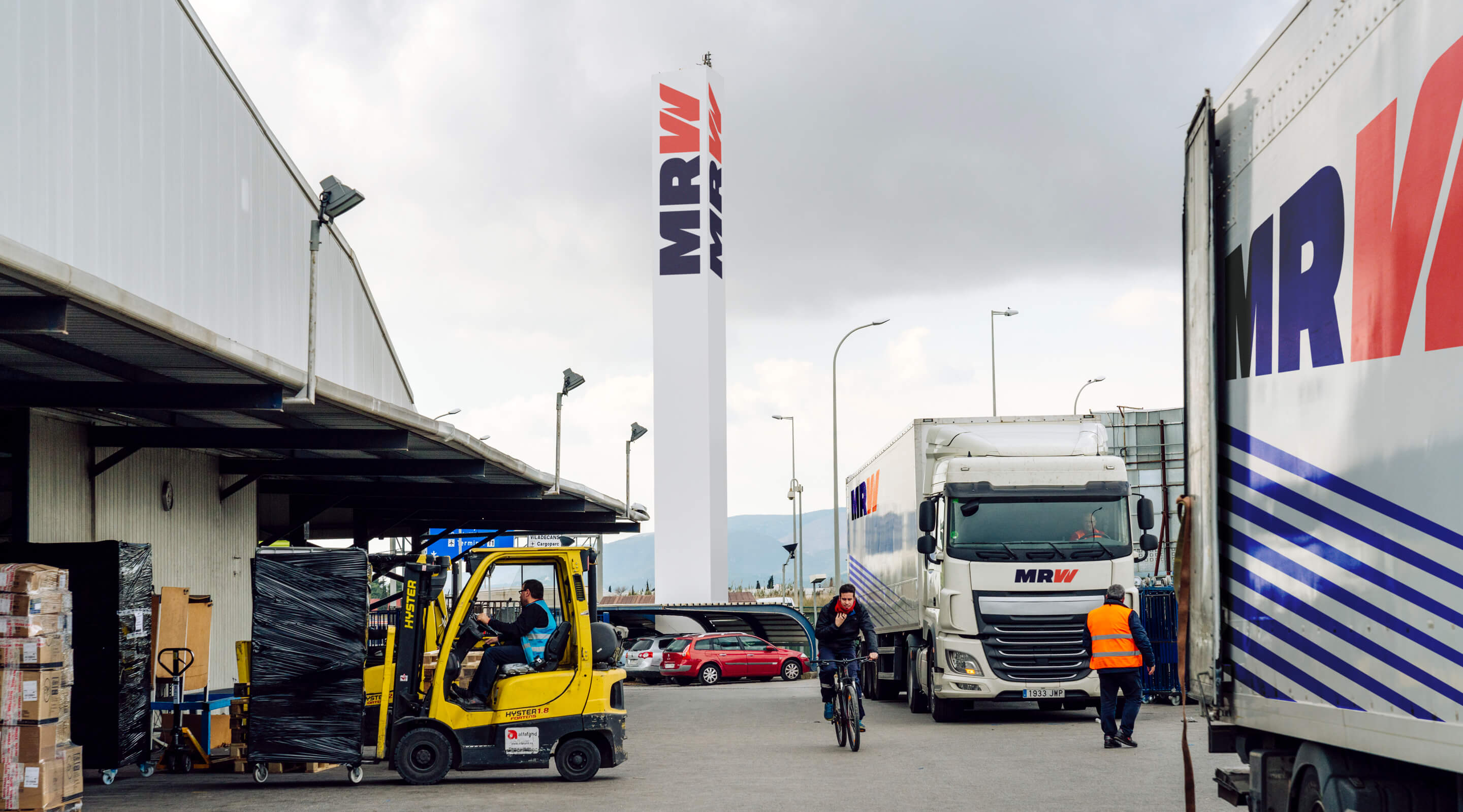
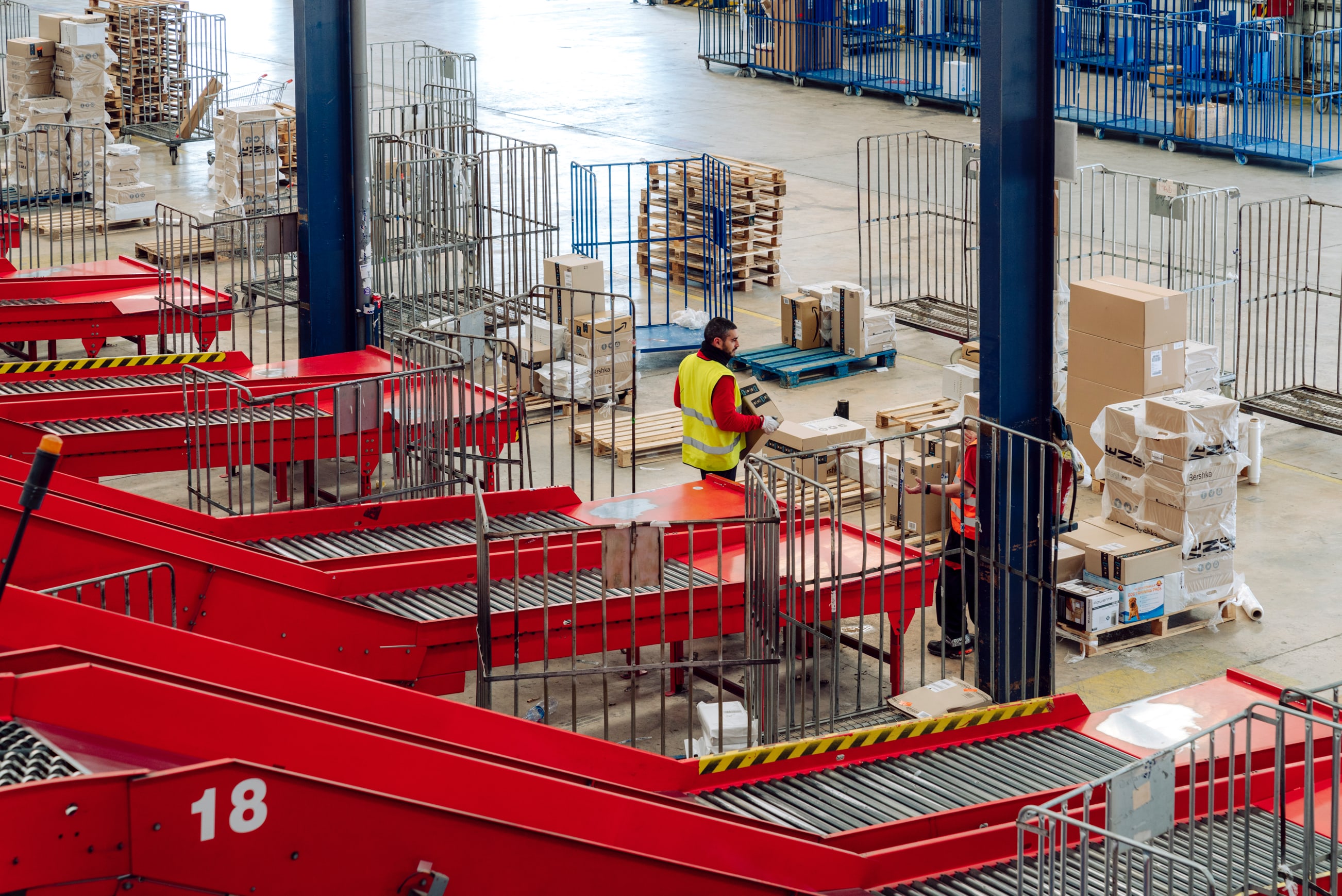
In the boom era of e-commerce and digitization, MRW is always striving to stay one step ahead of their competitors. The courier company set our branding team the challenge of delivering a more modern and energetic identity for them – one which reflects their new digital focus, while also retaining the feel of their trusted brand image.
The solution
The need for speed.
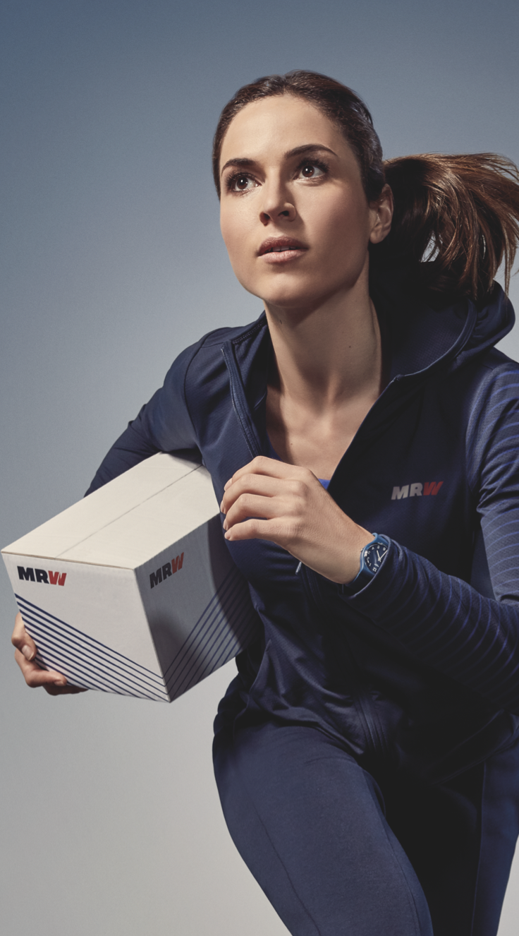
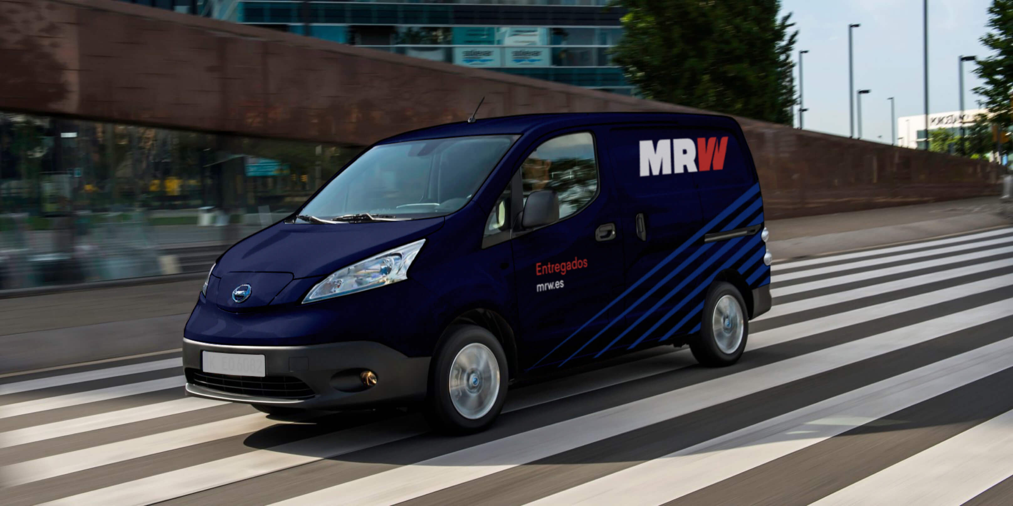
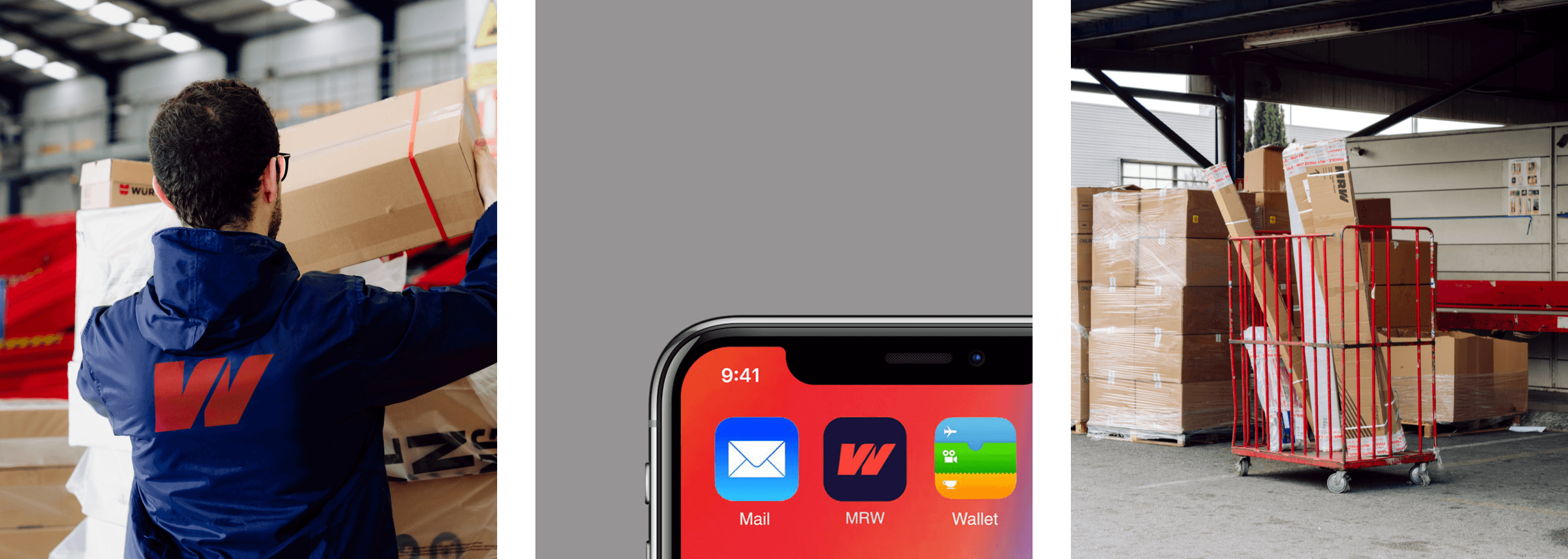
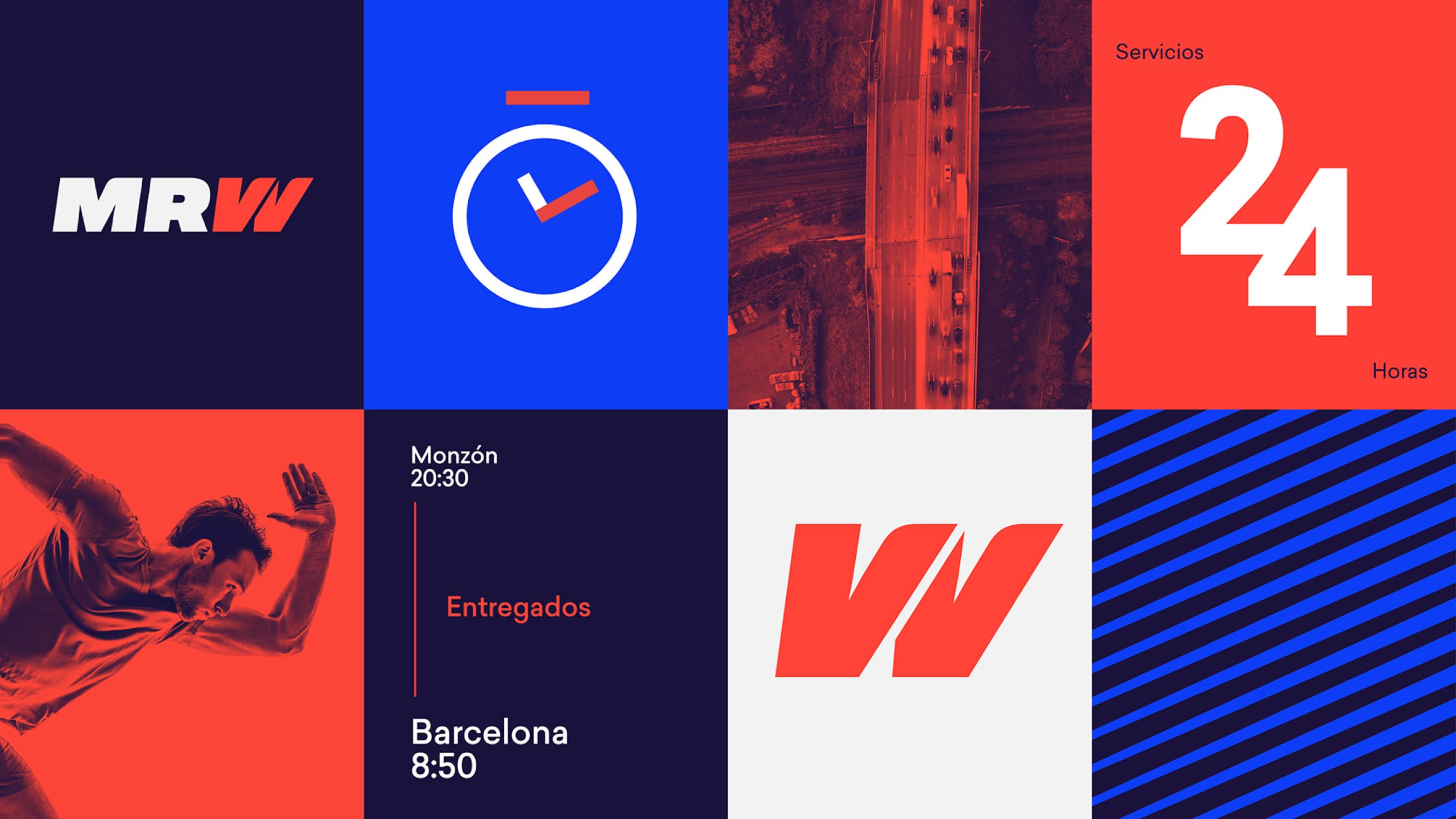
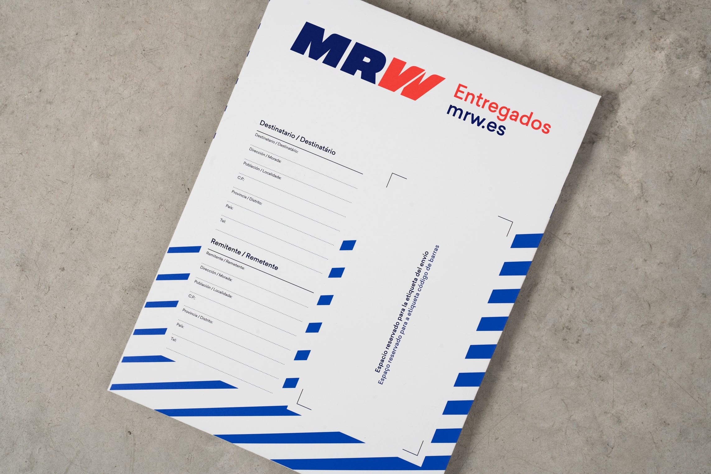
We remixed the logotype design with a dynamic new blue and red color scheme, creating greater contrast and better visibility in reduced sizes. The contours of the design aimed to convey speed, movement and precision.


What about realiability?
MRW’s existing logo was a frequent reference point. We wanted to maintain a recognizable through-line from past to present into future, creating consistency for MRW’s valued customers.
And how about MRW’s digital future?
We redesigned the iconic W of the logo into a double-tick design – a playful nod to the double tick ‘delivery’ symbol of messages online. We feel this approach effectively reflects MRW’s expansion into the digital world.
What we did
Strategy
Brand Strategy
Content Strategy
Brand Architecture
Design
Identity Design
Digital
Web Skinning
Advertising
Art Direction
Copywriting
Related projects
 Kave Home
How to succeed in the e-furniture industry
Kave Home
How to succeed in the e-furniture industry
view project