el Periódico
A new positioning for a leading newspaper
In an era dominated by content and in which the traditional conception of media as a destination is obsolete, how can a newspaper stay relevant? After being acquired by Prensa Ibérica, one of Spain's leading media companies, we partnered with El Periódico to help answer this question.
Committed to social progress
Based on an analysis of the reader's behaviours and preferences, we identified an opportunity to connect with a progressive target who consumes media as much for the information as for the experience. Informed by this finding, we proposed an equally progressive brand that frames conversations around social subjects with a poignant edge. Highly reliable, specialized and hyper local.

More digital, ubiquitous and sharp
The new brand revisits the paper's progressive legacy for the modern world. Prepared to live in a transmedia landscape, the new brand design favors clarity and directness among everything else. The typography has been simplified and layouts have been cleaned up to provide an enhanced reading experience.
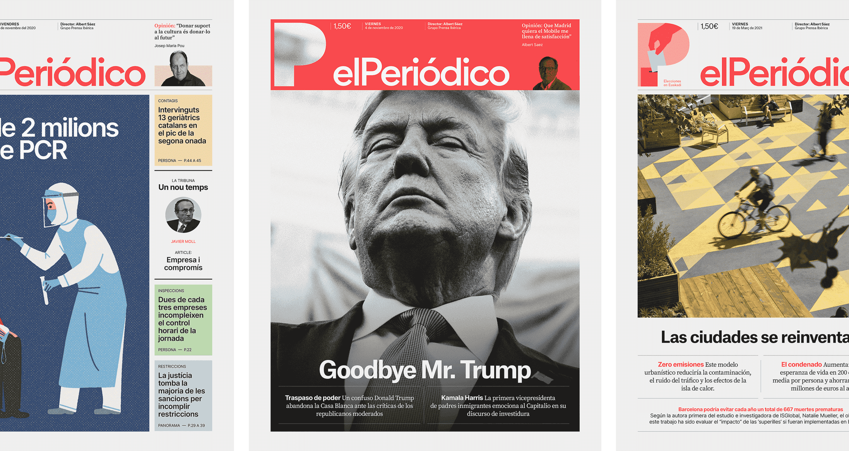
A new icon for a new era
In order to position El Periódico as a leading voice within the media landscape, we set out to create an iconic brand that could be easily recognized. That's why we developed a new symbol for the brand. An iconic "P" that frames conversations around people, planet and progress with a poignant edge. A key element in the newspaper header, every day it mutates to reflect the most relevant topic of the edition.

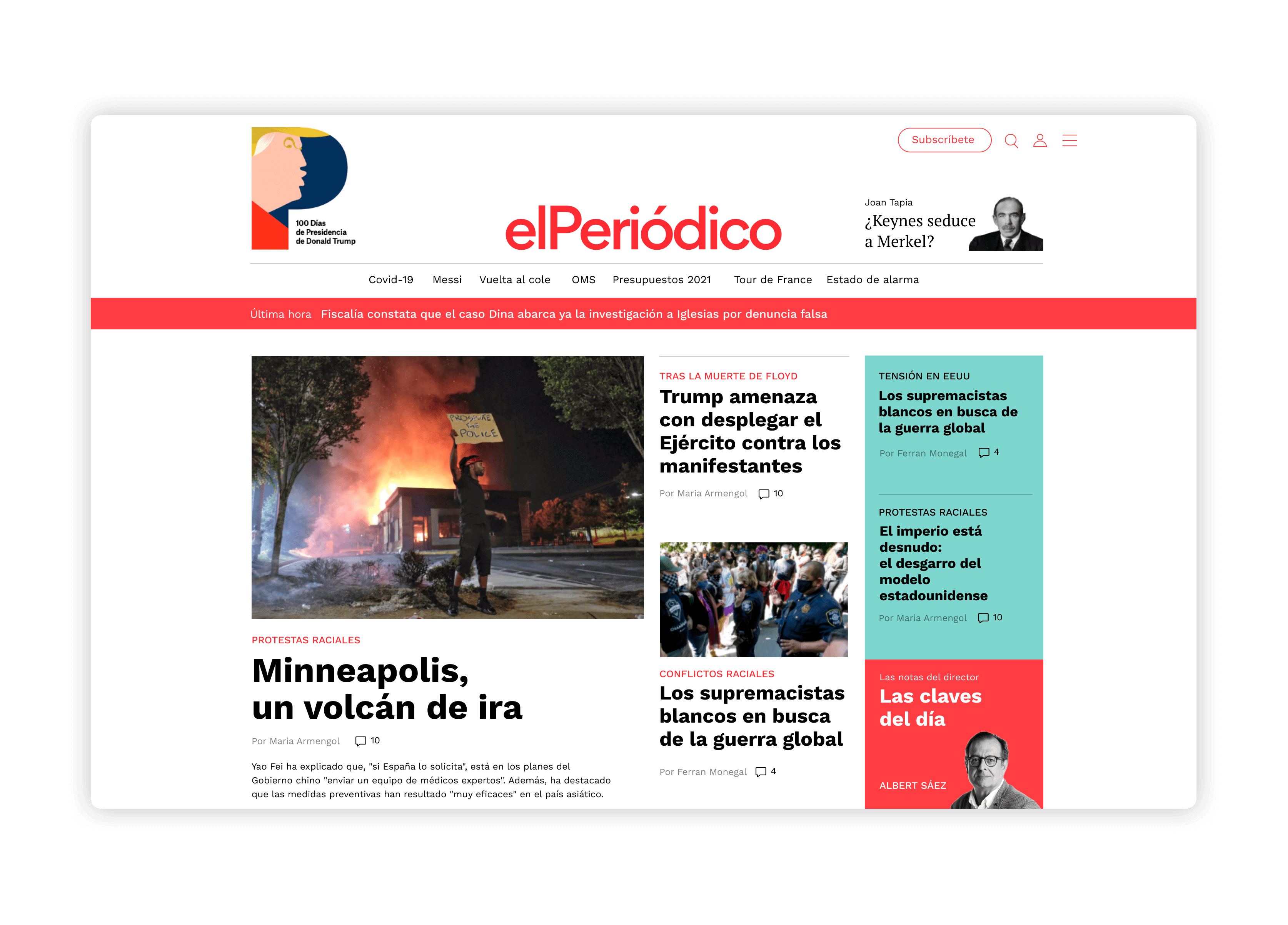
A hollistic visual language
The brands of today exist in the physical and digital worlds alike. That's why we developed a phygital visual system that guides how the brand should behave across touchpoints. Copy and photography gain equal relevance and create an interconnected dialogue.

What we did
Strategy
User Research
Brand Persona
Brand Strategy
Brand Design
Visual Identity
Editorial Design
Guidelines Design
Motion Design
view project